-1.png)
All you need to know about the dashboards in your Analytics section
Go straight to explanations of:
- Messaging⇾ Per Channel
- Messaging ⇾ Per Inbox
- Messaging ⇾ Per Role and Level
- Messaging ⇾ Per User
- Messaging ⇾ Distribution
- Messaging ⇾ Per category
- After Sales ⇾ Conversation Funnel
- After Sales ⇾ Conversation Metrics
- After Sales ⇾ Per Location/Department/User/Channel
- After Sales ⇾ Per Channel
- After Sales ⇾ Per User
- After Sales ⇾ Per Location
Explaining Potential - MECs
Firstly, what are MECs? These are Monthly Engaged Contacts - the total number of contacts who engaged with your organization through any of your messaging channels each month.
This graph gives you an indication of how many of your lead processes are running through Web1on1.
The potential number of Monthly Engaged Contacts is displayed as blue bars for each month.
The potential number of MECs is based on the number of inbound leads + workshop jobs. This can be configured in your account settings and should reflect the actual number of total leads via any channel for your organization.
In the graph, the green line represents your actual number of MECs. This enables you to compare your actual MECs with the potential.

How to use the dashboard:
You can use one filter:
- Date: use this filter to select the time period in which you want your data to display.
Explaining Potential - Users
Monthly Active Users
This dashboard gives you an insight into how many members of your organisation are using the Web1on1 app compared to how many there could be.
The blue bars show the potential number of users for your organization. The potential is based on the number of sales advisors + service advisors.
Your potential number of users can be configured in your account settings and should reflect the actual number of employees working in your sales and aftersales organization.
The green line represents your active users. These are users whose role is not as a guest and who engaged in at least one interaction with the app. Comparing active users with the potential number of users gives you an indication of the maturity of adoption of Web1on1 in your organization.

How to use the dashboard:
You can use one filter:
- Date: use this filter to select the time period in which you want your data to display.
Explaining Potential - Visitors
Monthly Website Visitors - Actual vs Potential
The Web1on1 chat widget registers an event every time someone visits your website. If a contact is visiting a website this event is counted. In order to make sure this event is not counted multiple times every visitor gets a cookie. Cookies remain active for 30 minutes and during this time the same visitor entering your website again is not counted. This graph shows the number of events generated by website visitors as a green line. The blue bars display the potential number of website visitors who could be engaging with you via live chat. .
The difference gives you an indication of what percentage of your website doesn’t have Web1on1 chat enabled. You can see how many more contacts you could potentially reach by placing the live chat widget across all of you web pages.
This is based on a comparison between the number of actual visitors your entire website is generating compared with the number of visitor events we’re generating. Your actual average monthly website visitors figure can be configured in your account settings..

Monthly Website Visitors - Leads & Service chats v Benchmark
The coloured bars in the graph show the number of chats categorized as leads, service chats and bot chats.
A lead is defined as a chat that contains information allowing you to reach the contact, service chats are results that do not contain contact information, and bot chats are those done by bots or a bot/human hybrid. The grey line represents the total number of chats expected from your website visitors. This benchmark figure is based on the number of potential monthly website visitors multiplied by the average chat conversion rate for your business type (dealership, brand, financial services).

How to use the dashboard:
You can use one filter:
- Date: use this filter to select the time period in which you want your data to display.
Explaining Messaging - Overview
Messaging Overview Dashboard
This dashboard provides you an overview of the messaging funnel for your organization.
The graph will display one of the five messaging metrics. Default selected is active conversations. The blue line in the graph represents the daily number of the metric selected.
By clicking on the check mark to the left of the five messaging metrics displayed on the left of the dashboard the dashboard will display that metric. For a definition of the selected metric click on the exclamation to the right of the metric.
 How to use the dashboard:

You can use one filter:
- Date: Use this filter to select the time period in which you want your data to display.
- Metrics: Click on the check mark on the left of the text to select the metric.
Explaining Messaging - Per device
Messaging per device
This dashboard allows you to understand on which devices your messaging is taking place. The pie chart shows the percentage number of chats for each device type, such as desktop, tablet and mobile. A fourth value no device is also present, where the app couldn’t retrieve information about the device used. This can happen, for example, when the contact blocks metadata. The percentages provide valuable insight into the preferred device contacts are using to visit your website. The bar chart shows the same data but in absolute numbers.
By clicking on the check mark to the left of the five messaging metrics displayed on the left of the dashboard the dashboard will display that metric. For a definition of the selected metric click on the exclamation on the right of the metric.

How to use the dashboard:
You can use one filter:
- Date: Use this filter to select the time period in which you want your data to display.
- Metrics: Click on the check mark on the left of the text to select the metric.
Explaining Messaging - Per channel
Messaging Per Channel
This dashboard allows you to understand on which channels messaging is taking place. The pie chart shows the percentage messaging for each channel, such as web, WhatsApp or Facebook. A fourth value no touchpoint is also present, where the app couldn’t retrieve information about the channel used. This can happen, for example, when the conversation never touched a channel (a conversation, for example, only took place in the inbox of a user). The percentages provide valuable insight into the preferred touchpoints contacts are using for messaging. The bar chart shows the same data but in absolute numbers.
By clicking on the check mark to the left of the five messaging metrics displayed on the left of the dashboard the dashboard will display that metric. For a definition of the selected metric click on the exclamation on the right of the metric.

How to use the dashboard:
-
You can use one filter:
- Date: Use this filter to select the time period in which you want your data to display.
- Metrics: Click on the check mark on the left of the text to select the metric.
Explaining Messaging - Per Inbox
Messaging Per Inbox
This dashboard allows you to understand to which inboxes messaging is routed. When messaging is routed an inbox is notified. Allowing users to open the conversation and to reply to a contact. Inboxes can be configured in your own organization as well in the Web1on1 organization when Web1on1 agents are also handling your conversations. The pie chart shows the percentage messaging for each inbox. The value no inbox is also present, where a conversation was never routed to an inbox. This can happen, for example, when the conversation was only handled by a bot. The percentages provide valuable insight into the inboxes used to respond to your contacts starting a conversation. The bar chart shows the same data but in absolute numbers.
By clicking on the check mark to the left of the five messaging metrics displayed on the left of the dashboard the dashboard will display that metric. For a definition of the selected metric click on the exclamation on the right of the metric.
-png.png)
How to use the dashboard:
You can use one filter:
- Date: Use this filter to select the time period in which you want your data to display.
- Metrics: Click on the check mark on the left of the text to select the metric.
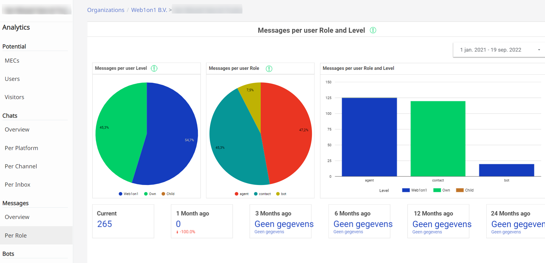
Explaining Messaging - Per Level
Messaging per level
This dashboard allows you to understand the level of users that are sending messages. The level of a user tells you to which organization the user belongs. Level 0 or 1 means the user is a Web1on1 agent, and level 2 or 3 represents a user that belongs to your organization. There are two pie charts, the first one showing the ratio of platform usage per level of users. These percentages give you an insight into the proportion of Web1on1 agents being used to engage with your contacts compared to your own.
The bar chart shows the same data, but in absolute numbers.
By clicking on the check mark to the left of the three messaging metrics displayed on the left of the dashboard, the dashboard will display that metric. For a definition of the selected metric click on the exclamation mark to the right of the metric.
Please note that for user metrics only three metrics are available.
How to use the dashboard:
You can use one filter:
- Date: Use this filter to select the time period in which you want your data to display.
- Metrics: Click on the check mark on the left of the text to select the metric.
Explaining Messaging - Per User
Messaging per User
This dashboard allows you to understand which users are messaging for your organization on the platform. Every time a user sends a chat message this is counted and shown in the dashboard. The percentages provide valuable insight in which users are messaging the most to your contacts. The bar chart shows the same data, but in absolute numbers.
By clicking on the check mark to the left of the five messaging metrics displayed on the left of the dashboard the dashboard will display that metric. For a definition of the selected metric click on the exclamation on the right of the metric.
How to use the dashboard:
You can use one filter:
- Date: Use this filter to select the time period in which you want your data to display.
- Metrics: Click on the check mark on the left of the text to select the metric.
Explaining Messaging - Distribution
Messaging Distribution
This dashboard shows a matrix of days of the week in the columns and hours in a day in the rows. This allows you to see the average amount of messaging per day of the week per hour.
The average is calculated to sum the amount of messaging for that day and for that hour and divide it by the number of weeks in the used date range. The heatmap provides valuable insight in which moments on a day are the busiest and which are the quietest.
By clicking on the check mark to the left of the five messaging metrics displayed on the left of the dashboard the dashboard will display that metric. For a definition of the selected metric click on the exclamation on the right of the metric.
How to use the dashboard:
You can use one filter:
- Date: Use this filter to select the time period in which you want your data to display.
- Metrics: Click on the check mark on the left of the text to select the metric.
Explaining Messaging - Per Category
Messaging Per Category
This dashboard allows you to understand a breakdown of the various customer journey categories selected when results are added to conversations. Since not all conversations end in a result, only effective chats and leads are available in the metrics selector menu. The pie chart shows the percentage number of results for each category, which gives you an insight into the overall requirements of your web visitors.
Categories are related to the buyer's journey. When a result is created and, for example, Aftersales is selected, the result relates to the buyer's aftersales journey for that customer. The percentages provide valuable insight in specific parts of the buyer's journey that website visitors are in, and how they relate to each other. The bar chart shows the same data but in absolute numbers.
The default dashboard shows categories for all effective chat results. Fmetrics will be displayed when clicking the check mark found when clicking to the left of the Leads link. For a definition of the selected metric, click on the exclamation on the right of the metric.
How to use the dashboard:
-
You can use one filter:
-
Date: Use this filter to select the time period in which you want your data to display.
-
Metrics: Click on the check mark on the left of the text to select the metric.
Explaining After Sales - Funnel
After Sales conversation funnel
This dashboard allows you to understand the different phases of an after sales service conversation. The first phase is when a customer is sent a notification via WhatsApp to start a conversation with the dealership looking after their vehicle. The second phase shows whether the customer accepts the invitation to chat by replying to the WA message. Once engaged, the third phase is when updates and information about the after sales process is shared in the conversation by the service advisor, for example to inform the customer when their car is ready for collection.
In the funnel graph you see the number of conversations in all three phases in a given date range. A table is shown on the right that displays a list of conversations where the invitation to join the after sales conversation was sent, but the contact didn't join the conversation.
The URL is clickable and allows you to directly investigate why the contact did not accept the invitation. On the right of this table there is another table displaying a list of conversations where the contact joined the conversation, but the dealer did not. Here the URL is also clickable to directly investigate why this is happening.
For definitions of the funnel and the tables click on the exclamation mark on the right of the table.
How to use the dashboard:
You can use one filter:
-
Date: Use this filter to select the time period in which you want your data to display.
Explaining After Sales - Metrics
After Sales metrics
This dashboard allows you to get an understanding of how much Web1on1 is used in your after sales processes. And it allows you to dive deeper into your organization to determine which locations, departments, users and channels are using Web1on1.
The main metric used to determine if Web1on1 is used is sessions. Every time there is interaction between a contact and a dealer a new session is created.
Other measures available are conversations, messages, fields and results.
The page contains four tables:
After sales metrics per location -> department -> user -> channel
This table is expandable by clicking on the + sign on the left of the label location in the table. In this way the metrics are first aggregated by locations, next by location and department, followed by location, department and users and lastly by location, department, user and channel.
This table allows you to directly dive deeper into the results when for example a location has a high volume of sessions you can dive deeper into the data which user of which channel is delivering the exceptional results. This can be the start of an optimization process to improve other departments, users of channels.
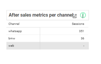
After sales metrics per channel
This table shows all active channels for your organization. Even if there are no sessions done for a channel. This allows you to verify if channels that are active for your organization are actually used. This can be a starting point to debug why certain channels are not used and reactive them.
In the table you can add more metrics if you need them for your analyses by clicking the optional metrics in the header of the table. In this way you can add conversations, messages, fields and results to the graph.
After sales metrics per user
All active users for your organization are shown in this table. Even if there are no sessions done by a user. This allows you to verify if active users are actually using Web1on1. This can be a starting point to evaluate the performance of users in Web1on1.
In the table you can add more metrics if you need them for your analysis by clicking the optional metrics in the header of the table. In this way you can add conversations, messages, fields and results to the graph.
After sales metrics per location
To provide insight into the locations and departments you have configured in Web1on1 and if they use Web1on1 or not, this table shows all active locations and expandable to departments for your organization, even if there are no sessions done for a location or department. This allows you to verify if locations or departments that are active for your organization are actually using Web1on1. This allows you to analyze which locations or departments perform better then other ones.
In the table you can add more metrics if you need them for your analyses by clicking the optional metrics in the header of the table. In this way you can add conversations, messages, fields and results to the graph.
Also this table is expandable to locations -> departments. By clicking on the + to the left of locations you can expande to departments or by clicking the - roll up to locations.
How to use the dashboard:
You can use one filter:
- Date: Use this filter to select the time period in which you want your data to display.
- Location: Select one or more of your locations
- Department: Select one or more of your departments
Explaining Bots - Performance
Bot performance overview
This table gives you a high level insight into all the active bots running for your organization and their performance indicators.
The following performance indicators are shown:
- Messages
- Bot started
- Leads
- Chatpoints
- Points (V1)
Please find the definitions of those indicators here.
The column Name is the original name of the bot that can’t be edited. The description can be configured by the client in the organization’s bot settings and may be the same as the original name if it hasn’t been changed.

How to use the dashboard:
You can use one filter:
- Name: you can select by name one or more bots you want to see in the table.
- Date: Use this filter to select the time period in which you want your data to display.
Explaining Bots - Trend
Bot performance trend analysis
This dashboard enables you to perform trend analysis for the bots running for your organization. It can be used to analyze deeper the performance of a bot over time.

How to use the dashboard:
You can use two filters:
- Name: you can select one or multiple bots you want to display in the graph below
- Date: use this filter to select the right period you want to display your data in
Selecting different measures
By clicking the optional metrics-button inside the graph you can select between: messages, bot started, leads, Chatpoints and points(V1)
